In the game of Sudoku, a 9 × 9 grid is to be filled in with the digits 1 – 9, such that in each column, each row, and each 3 × 3 sub-grid, each of the nine digits only appears once. There are other aspects to the game that make it easier or harder as a puzzle, but it’s the challenge of the filled-in grid that appeals to me.
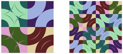
Figure 1: Sudoku 4b, without and with grid outline.
Studying the cells, it may seem that the elemental images are based on quarter- and half-circles. That is indeed the case and the first layer and its alphabet are shown in Figure 2.
Figure 2: First layer, layer with grid, and corner showing alphabet.
For each layer, the alphabet of elemental images was composed of rotations of a primary shape, as suggested in Figure 2. The shapes and colors of the elements in all four alphabets were chosen to be complementary and so that they would effectively show their own colors and a wide variety of colors when merged. The primary shapes are shown in Figure 3.

Figure 3: Primary shapes for Sudoku 4b image alphabets.
In Sudoku 4a, the alphabets are based on rectangles. They are variously: solid and dark, solid and light, split light/dark, or split dark/light. The four primary images, one layer’s alphabet, and the finished image are shown in Figure 4.
Sudoku 4c is structurally similar to 4b. In this case, the primary images are triangular regions that cover (positive space) or leave uncovered (negative space) one-quarter or one-half of the grid square. The primary images and final piece are shown in Figure 5.
This series of four images explored the concept of filling a 4 × 4 grid in a Sudoku-like manner, except using geometric shapes and colors to create the alphabet of elements. In addition, layering of different grids was employed to highlight the interplay between structures.


